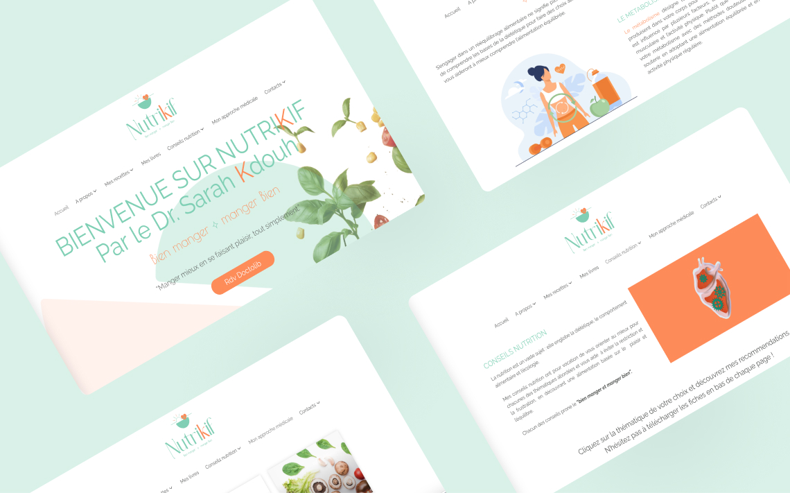
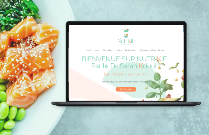
Sarah is a doctor and nutritionist. At the time, she contacted us, she was running a blog focused on healthy recipes. When she approached us, she wanted to elevate her personal brand by presenting a more professional image with a cohesive visual identity and a dedicated website. We developed a complete branding package for her, including a custom logo, brand guidelines, and a fully designed website. The site integrated over 100 recipes from her previous blog, offering a fresh, modern presentation that aligned with her goals. A year later, Sarah reached out again to enhance her online visibility through SEO. We worked on optimizing her website for Google by subtly redesigning the homepage to incorporate targeted keywords. Additionally, we created a new section to support SEO-focused content, helping her achieve better rankings and broader reach.
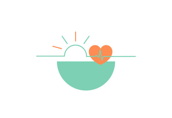
For the logo design of Nutrikif, we aimed to capture the balance between nutrition and medicine, reflecting Sarah’s dual expertise as a doctor. She wanted a minimalistic and elegant logo that conveys the enjoyment and pleasure of eating, without associating food with frustration or restriction. To embody this vision, we chose a bowl to symbolize nutrition, with a sun rising from it to represent the joy and delight in eating well. The inclusion of a heart and abstract graphic elements signifies the medical aspect, aligning with her approach to promoting health and wellness through positive food experiences.
In addition to the symbolic elements, we carefully chose the colors green and orange for the Nutrikif logo. Green represents health, growth, and balance, reinforcing the focus on nutrition and wellness. Orange, on the other hand, evokes warmth, energy, and positivity, reflecting the joy and pleasure of eating well. Together, these colors not only align with Sarah’s vision of promoting a healthy relationship with food but also create a vibrant and inviting visual identity for the brand.